3d: The Process
Getting Your Idea into Production
In this case the client supplied a drawing
A sketch of any kind is really useful to us in the initial stages. Most people are reluctant to provide a sketch on the grounds that they "can't draw", however, the simple sketch show relative sizes and layout and is a great start for us.

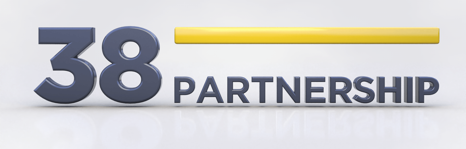
This is the first image the client sees
From the drawing, we make the shapes and text needed and size all of the elements of the design to match the sketch. All of the elements are assigned a "clay" material (in this case pale grey) so the client is not distracted by colours. This image is to confirm the proportions of all of the elements are correct.

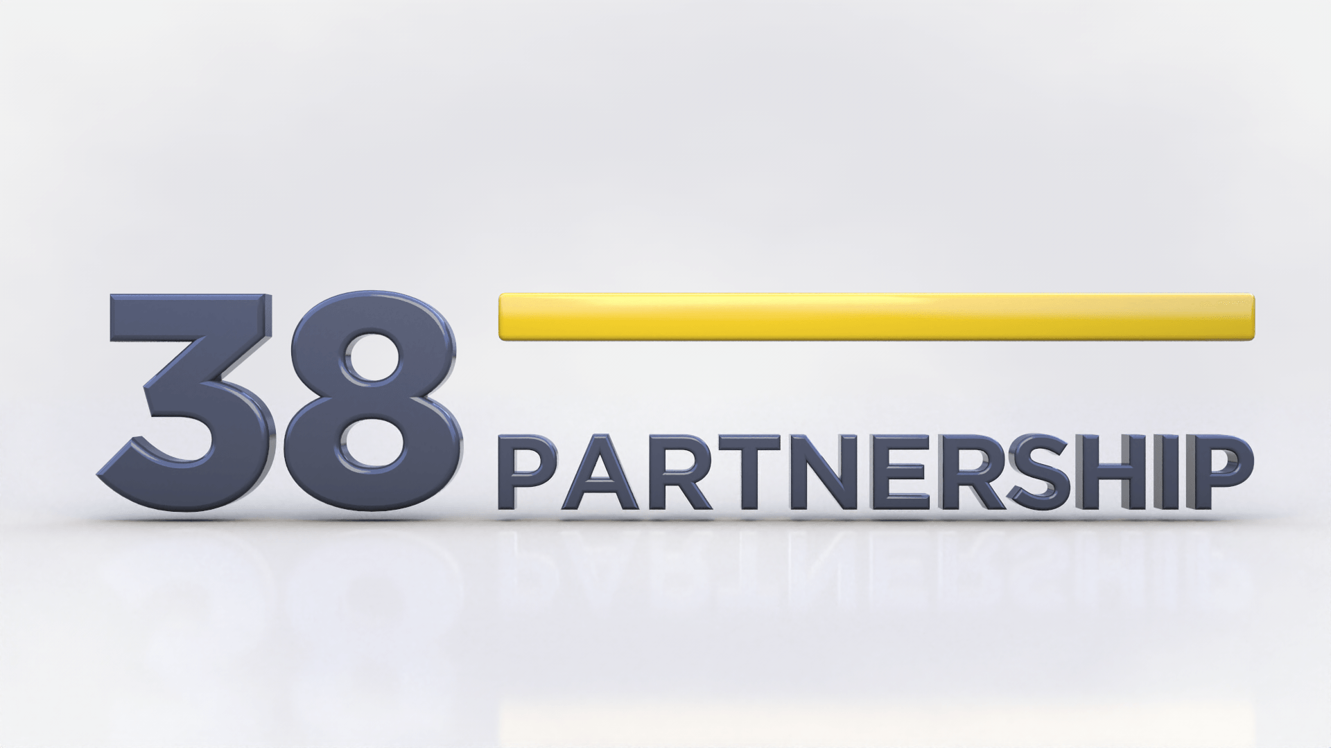
The Client now wants text on the reverse side of the sphere
The front text is duplicated, resized and the VR portion is added so the text becomes 3 lines.

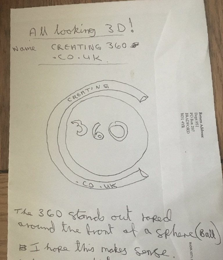
Client Supplies an Image for colours
In this case the client sent the image seen here to use for the colour scheme. We used the gold as is, but removed the colour from the pale and dark grey so they are both neutral.
Sphere Gold
This was the initial idea for colour placement. It was rejected for the Final scheme

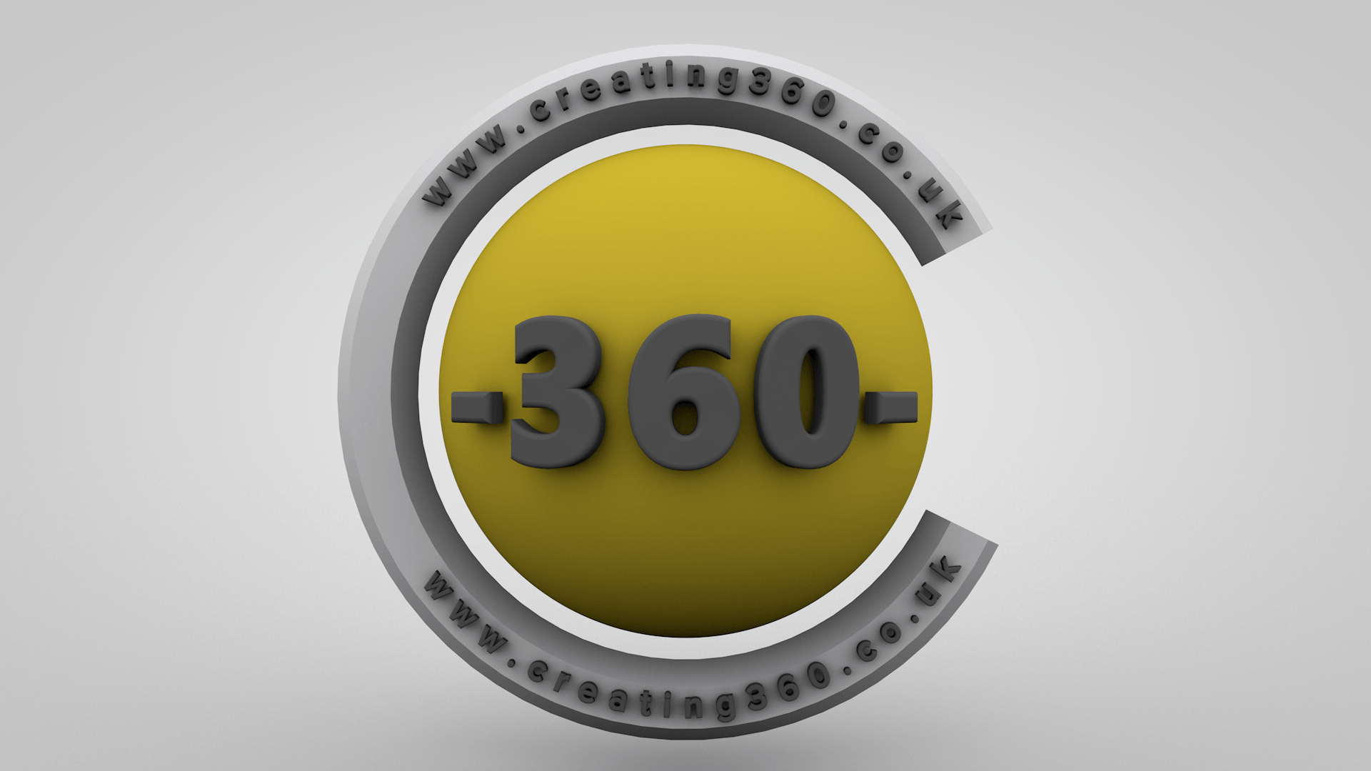
Sphere Pale Grey
The colour placement seemed to work best and allows all of the elements to be clearly seen.

Real world materials, endless options
After chasing materials about for a while, the text was made to emulate hard, gloss plastic. Metalic was used on the sphere and the "C" section

Adjustment of the Light Map and positioning of the reflections
Lighting in this case was provided by and "environment map". This, in simple terms wraps a sphere around the 3d stage and projects light and reflections into the space. The map can be rotated, allowing us to move reflections across the surface of the elements.